Client
Green Chef
Type
UX/UI Design
Year
2025
Research
Briefing
Competitor analysis
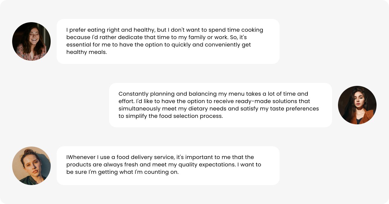
User research
In-depth interview
Ideation
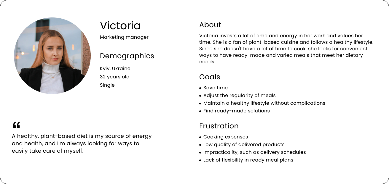
User persona
Brainstorm & sketch
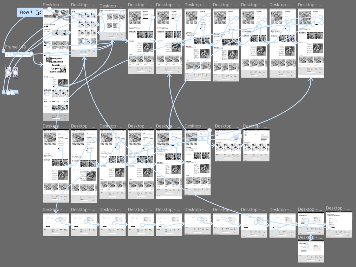
User flows
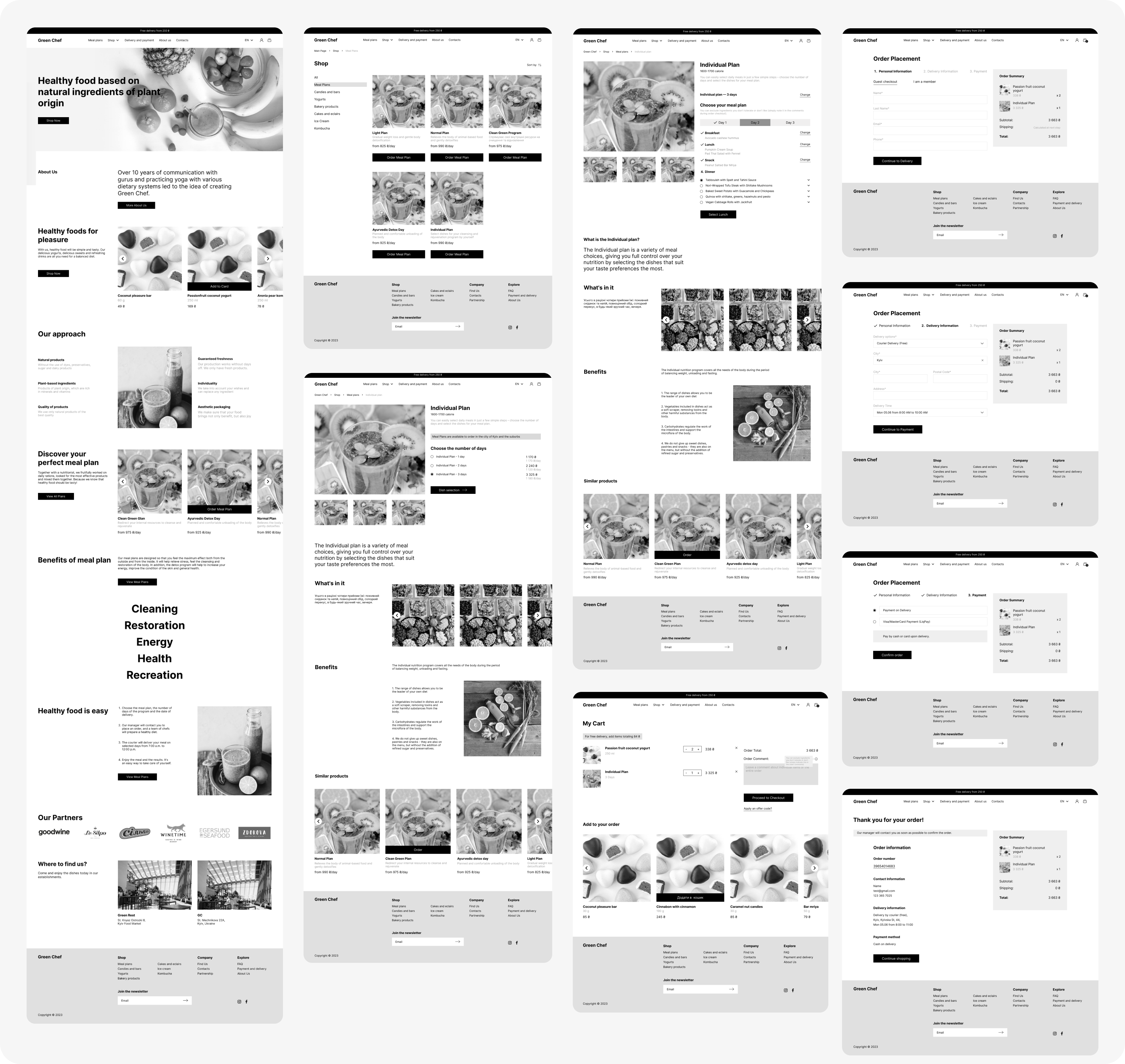
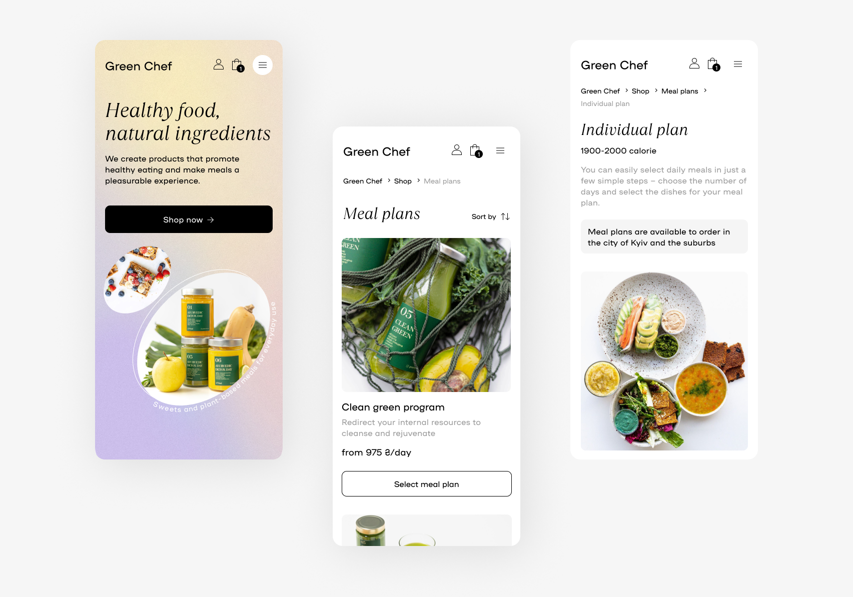
Wireframes
Prototype
Prototyping
Testing
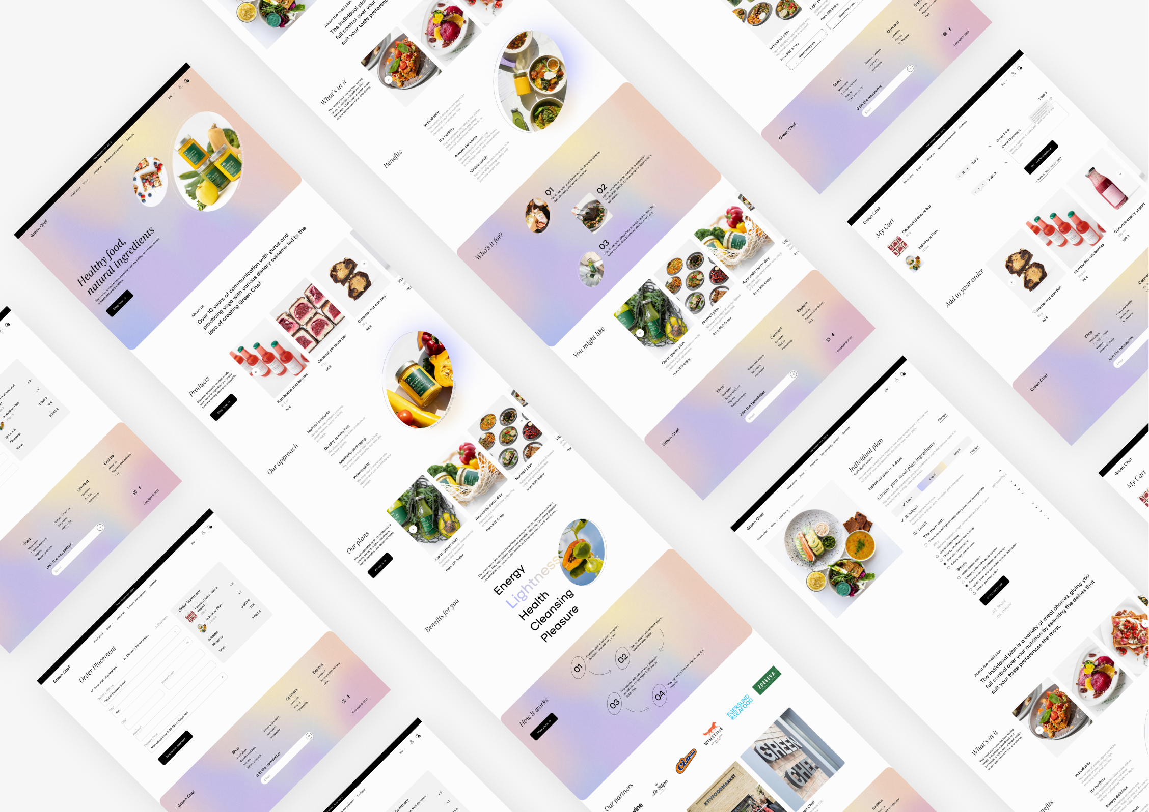
Design
Moodboard
Concept
Style guide
User interface